Wednesday, December 1, 2010

Final essay for DMF 201 class

This was a very fun project.  I had two copies made at the school’s printing office, one of these copies I will be sending to my sister, and I will keep the second for myself.
Working on a close time schedule is something I have done several times. This was not really any different for me.  I needed to select the pictures and the poetry to place in the book and make choices regarding book size and placement of the elements.  My completed book was ready for printing this week on Monday, with one exception, I had not received the information that I need to save the file as a PDF.  Once this was done, I was able to present a disc and have the book printed.
I found that all skills acquired though out the term helped with this project.  Knowing how to use the tools in Photoshop helped me make some important changes to several of the pictures I included in the book.  In two of the pictures I chose to alter the background so the subject of the photo was what drew the eye instead of the cluttered background.  On many of the pictures I needed to alter the size of the image to fit the page format I was using for my book.   This was easily done using the resizing tool in Photoshop.  On others I used layers to create a pretty border for the picture.
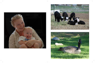
Design choices I made that proved to be important were the size of the book, the placement of the elements on the pages and sizing of pictures and text.  For size, I chose 8 ½ by 11 format.  This was in part because of one of the poems chosen to go in the book.  “A Mother’s Love” I have always thought looked best printed on letter sized paper.  This poem is centered on one page and across from it is a photo of a young mother holding her young son, which is also centered.  Another choice involved the length of the book, to accommodate the quantity of pictures and the poetry I wanted to place in the book I needed a 16 page book including front and back covers. Other design choices included where to place which picture and which ones went best with the poems included in the book.  I also found that I needed to write a new poem for the book.  This poem, “Generations”, is placed in the center of the book and helps the pictures placed with it tell their stories.
Ultimately, I plan to sell this book and to create others as well for sale as well.  Some copies of it I will give out as gifts to special individuals, in particular those who gave me a review to place on the back of the book.  Again this was a very fun project and the knowledge gained throughout the term all helped with the completion of it.  My own sense of time and the need to complete it in a timely manner also proved helpful.  I believe I can complete other books of a longer length and in a reasonable time frame.  Therefore I plan to use the knowledge gained in this class as a whole and this project in particular to create other books and sell them as well.

Friday, November 19, 2010

written changes

I have changed the book description to read 

This book contains original poems and is illustrated with beautiful photos. I have enjoyed writing the poems and taking the photos contained in this book. All have been written or taken during the last twenty five years.

I will be adding the book opinions later this week. The plan is for two or three opinions.

Should I move the picture on the back cover? right now it is at the top of the page. if moved, it would be placed between the description and opinions.

revision again...almost done


Wednesday, November 17, 2010

update to book

these picts show a recent revision of the book.  i have been working on still another revision which i may post tomorrow.


Friday, November 12, 2010

Book thoughts

I know my sample pages for my book have some blank pages.   These pages I plan to put photos in.
I would like some ideas on different fonts and suggestions on The Title. I am not sure if the one I chose fits or if I should change it.
So far this has been a fun and interesting project. The only trouble has been figuring out In Design. I am slowly doing so, but in the process forgetting some of how to use Photoshop.
Well that is all for now. maybe later I will have more thoughts.

project book jpeg's


Sunday, November 7, 2010

Book Proposal

I propose to use my photography and poetry to create a book 8 to 12 pages in length. The front cover will have a unique photo with text. The back cover will have a brief description of the book’s contents. There may be a listing of photos and poetry inside. The photos and poetry may alternate or they may not.
The proposed subjects for the photos are sheep, horses, and household pets. The poetry may cover the same subjects as well as nature and other things that strike me as appropriate to this book project.
I would like some advice on the dimensions for use with this book. 9x12 inches seems right but so does 5x8 inches.

Sunday, October 31, 2010

Poster essay

The posters were a very fun project. I chose to do a movie and propaganda poster. Both challenged me in different ways, and I learned different things about using Photoshop to get them completed.  The expected challenge is why I chose the poster themes I did. I almost did a third poster using the final theme as well.
IT, also known as “Interesting Times” is a movie. In the process of creating this poster I learned more about the “text “tool and how it works. Using the vertical type tool, I found I had to type my words in backwards. This means I had type “Times Interesting” in order to get the words to appear as I desired. Using the text tool I also explored the choice of text color for this poster. Creating this poster also taught me about more way to manipulate color and photos. I used one of my own photos from this past spring. There are four different copies of the photo. I changed the sizes on two of the copies and added two hue and sat layers between the photo layers. I altered the opacity on a couple of the layers.
JOBS the second poster I experimented a great deal with color and opacity. The background is at about 50% opacity in both versions that I posted. I also used the shape tool to create this poster. My brother has taken a few copies of this poster to give them a real life trial at his school. He plans to post them in a lab where he works and observe and report to me on how people respond to them. This poster is actually the one I completed first I overheard a cement about “job” being an acronym and decided to take it a step further. It took me most of the week to figure out how to do this one and then to get it so I was happy with the results.
One final note, as a result of writing this essay I learned something new about our use of Language. “An acronym” two words not one. When spoken it sounds like a single word, though when written it is two words. So art projects have the ability to cause you to learn things from other subjects including English, Math and Science.

Sunday, October 24, 2010

Portrait Soup Essay

In some ways this was an easy assignment and in others it was difficult. I found it easy to photograph things in nature, but difficult to photograph people. Getting a self-portrait also was a small problem, though I was ultimately successful and have posted two.
Handling my camera has always been a small challenge in some ways for me. This project has encouraged me to push my camera further and to push my abilities in using it successfully. The self-portrait caused me to review using the timer function. The portrait of the dog required some work on position while using the camera. As usual, when I take my camera out, I take hundreds of pictures and find it to be a challenge to shrink the number down to fit an assignment. In this case I took over 400 pictures over the week and had to then shrink the number down to fit and then I found myself with about 30 pictures. I worked with these and still posted about 15 to 20 of them. To help me do this I used “Bridge” to help me with previewing all of the pictures. This helped me to shrink down the number of pictures though I still found myself wanting to post all that I could.
In Alphabet Soup, I used Photoshop on all but four of the pictures. In these pictures I typically used curves, hue and sat and the black and white layer tools. The picture that looks like a “N” makes the most extreme use of the curves tool. This one has small flowers at the points of the N which is a lowercase letter in cursive handwriting.
In Portraits, I used the curves tool on all posted pictures. On one I also used the crop tool, because I felt the photo worked better. I find that I do very well taking portraits of animals; however taking portraits of people is not so easy. I am not comfortable asking people if I can take pictures of them, even when I know them. When I do not know a person it is even harder for me to do. Critters do not get upset when you take pictures of them, nor do you need to ask permission to take their picture.
I do recognize that some of my pictures in Alphabet Soup could have been used in Portraits however I preferred them where I posted them. This was a very fun exercise and I really enjoyed taking the pictures for it. I even enjoyed the time consuming part of paring down the number of pictures to fit the assignment.

Friday, October 15, 2010

Type essay...

This was an interesting project. I really enjoyed it. The project caused me to become a bit inventive, especially when I decided to use the Chinese characters are my Chinese Pug’s name.
I experimented with several fonts in all of my projects. Some of the fonts I liked and some I did not like. There did not seem to be any difference in tails or no tails to the fonts I liked and used. My choice of font was based on how I perceived that the selected letter looked in various fonts.
Some of my letters are random (I asked my cat to choose) and some were deliberately chosen for personal connections. The letters “F”, "A" and “H” were chosen at random (with the cat’s help). I own a small sheep ranch and the other letters are the initials from its name. The Chinese characters are from my dog’s name.
I rasterized five of the letters after copying them, on the one included with this essay. These copies were then adjusted with the brush tool, using a couple different tips.
I enjoyed working with this project. It caused me to think and consider choices and why I thought one font was better than another for each letter. Please enjoy all of my posted work. I did several others that I have chosen not to post.

Text samples


These are some of the project results from this assignment. I added the final one because I thought it was interesting and that people might enjoy seeing the original spelling of my dog's name. It is in Chinese characters. 
Wa Dou, a dog's name